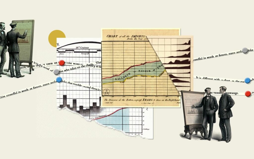
Almost two and a half centuries after its first publication, Adam Smith’s An Inquiry into the Nature and Causes of the Wealth of Nations is much better known as simply The Wealth of Nations. Had he written it today, the text itself, which runs between a formidable 500-700 pages in most editions, would also be considerably shorter. It’s not just that writers in Smith’s day went in for length per se (though many now read as if they did), but that graphs hadn’t been invented yet. Much of what he’d discovered about the nature of economics could have been expressed more concisely — and much more clearly — in pictures rather than words.
As it happens, the kind of informational graphs we know best today would be invented by Smith’s fellow Scot William Playfair in 1786, just a decade after The Wealth of Nations came out. “Data visualization is everywhere today, but when Playfair first created them over 200 years ago, using shapes to represent numbers was largely sneered at,” says Adam Rutherford in the Royal Society video above.
“How could drawings truly represent solid scientific data? But now, data visualization has become an art form of its own.” There follow “five graphs that changed the world,” beginning with the map of water pumps that physician John Snow used to determine the cause of a cholera epidemic in 1850s London, previously featured here on Open Culture.
We’ve also posted W. E. B. Du Bois’ “handmade charts showcasing the educational, social, and business accomplishments of black Americans in the 35 years since slavery had been officially abolished.” The other world-changing graphs here include Florence Nightingale’s “coxcomb” that showed how unsanitary hospital conditions killed more soldiers during the Crimean War than did actual fighting; the so-called Kallikak Family Tree, a fraudulent visual case for removing the “feeble-minded” from society; and Ed Hawkins’ more recent red-and-blue “warming stripes” designed to present the effects of climate change to a non-scientific audience. Using just blocks of color, with neither numbers nor text, Hawkins’ bold graph harks back to an earlier golden era of data visualization: after Playfair, but before PowerPoint.
Related content:
The Art of Data Visualization: How to Tell Complex Stories Through Smart Design
Florence Nightingale Saved Lives by Creating Revolutionary Visualizations of Statistics (1855)
Kurt Vonnegut Diagrams the Shape of All Stories: From Kafka’s “Metamorphosis” to “Cinderella”
A Proportional Visualization of the World’s Most Popular Languages
The History of Philosophy Visualized
Based in Seoul, Colin Marshall writes and broadcasts on cities, language, and culture. His projects include the Substack newsletter Books on Cities, the book The Stateless City: a Walk through 21st-Century Los Angeles and the video series The City in Cinema. Follow him on Twitter at @colinmarshall or on Facebook.

