
“If you see a pie chart projected twelve feet high in front of you, you know you’re in the hands of an idiot.” These words have stuck with me since I heard them spoken by Edward Tufte, one of the most respected living authorities on data visualization. The latter-day sins of pie-chart-makers (especially those who make them in PowerPoint) are many and varied, but the original sin of the pie chart itself is that of fundamentally misrepresenting one-dimensional information — a company budget, a city’s population demographics — in two-dimensional form.
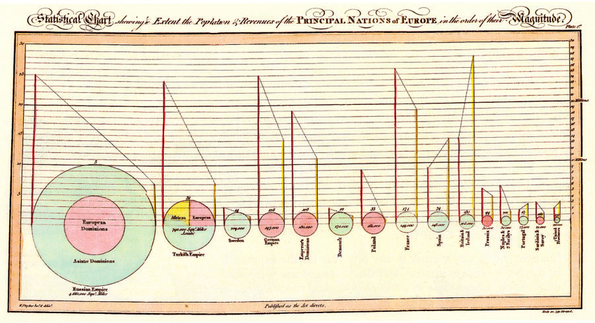
Yet the pie chart was created by a master, indeed the first master, of information design, the late-eighteenth- and early-nineteenth-century Scottish economist William Playfair. Tufte includes Playfair’s first pie chart, an illustration of the land holdings of various nations and empires circa 1800, in his book The Visual Display of Quantitative Information.
“The circle represents the area of each country,” Tufte explains. “The line on the left, the population in millions read on the vertical scales; the line on the right, the revenue (taxes) collected in millions of pounds sterling read also on the vertical scale.” The dotted lines between them show, in Playfair’s words, whether “the country is burdened with heavy taxes or otherwise” in proportion to its population.

Playfair was experimenting with data visualization long before his invention of the pie chart. He also came up with the more truthful bar chart, history’s first example of which appeared in his Commercial and Political Atlas of 1786. That same book also contains the striking graph above, of England’s “exports and imports to and from Denmark and Norway from 1700 to 1780,” whose lines create fields that make the balance of trade legible at a glance. A much later example of the line graph, another form Playfair is credited with inventing, appears just below, “exhibiting the revenues, expenditure, debt, price of stocks and bread from 1770 to 1824,” a period spanning the American and French Revolutions as well as the Napoleonic Wars.

It’s safe to say that Playfair lived in interesting times, and even within that context lived an unusually interesting life. During Great Britain’s wars with France, he served his country as a secret agent, even coming up with a plan to counterfeit assignats, a French currency at the time, in order to destabilize the enemy’s economy. “Their assignats are their money,” he wrote in 1793, “and it is better to destroy this paper founded upon an iniquitous extortion and a villainous deception than to shed the blood of men.” Two years after the plan went into effect, the assignat was worthless and France’s ship of state had more or less run aground. Playfair’s measures may seem extreme, but then, you don’t win a war with pie charts.
Related content:
The Art of Data Visualization: How to Tell Complex Stories Through Smart Design
Florence Nightingale Saved Lives by Creating Revolutionary Visualizations of Statistics (1855)
Kurt Vonnegut Diagrams the Shape of All Stories: From Kafka’s “Metamorphosis” to “Cinderella”
Based in Seoul, Colin Marshall writes and broadcasts on cities, language, and culture. His projects include the Substack newsletter Books on Cities, the book The Stateless City: a Walk through 21st-Century Los Angeles and the video series The City in Cinema. Follow him on Twitter at @colinmarshall or on Facebook.