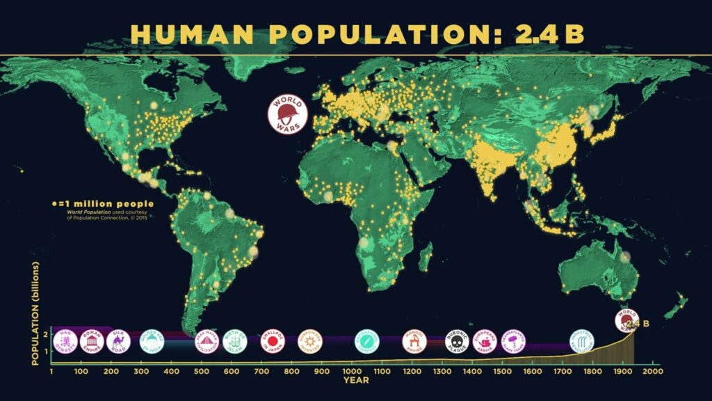
Having come out less than two weeks ago, the American Museum of Natural History video above incorporates up-to-date information on the number of human beings on planet Earth. But what’s interesting here isn’t so much the current global-population figure (eight billion, incidentally) as how we reached it. That story emerges through an animated visualization that compresses a period of 300,000 years — with all its migrations, its growing and declining empires, its major trade routes, its technological developments, its plagues, and its wars — into about four and a half minutes.
“Modern humans evolved in Africa about 300,000 years ago,” says the video’s explanatory text. “Around 100,000 years ago, we began migrating around the globe,” a process that shows no signs of stopping here in the twenty-first century.
The same can’t be said for the way our numbers have increased over the past few hundred years, at least according to the projection that “global population will peak this century” around ten billion, due to “average fertility rates falling in nearly every country.” For some, this is not entirely unwelcome, given that “as our population grows, so has our use of Earth’s resources.”
It’s been a while since the developed world has felt a widespread fear of overpopulation, which had a climate change-like power to inspire apocalyptic visions in the nineteen-seventies. Nowadays, we’re more likely to hear warnings of imminent global population collapse, with low-birthrate countries like South Korea, where I live, held up as cautionary demographic examples. From another perspective, the patterns of humanity’s expansion thus far could also be used to illustrate calls to explore and colonize other planets, not least to secure our species a path to survival should something go seriously wrong here on Earth. However our population graph changes in the future, we can rest assured that we’ll always think of ourselves as living at one kind of decisive moment or another.
Related content:
Hans Rosling Uses Ikea Props to Explain World of 7 Billion People
How Humans Migrated Across The Globe Over 200,000 Years: An Animated Look
Colorful Animation Visualizes 200 Years of Immigration to the U.S. (1820-Present)
Who Is the World’s Most Typical Person?
Based in Seoul, Colin Marshall writes and broadcasts on cities, language, and culture. His projects include the Substack newsletter Books on Cities, the book The Stateless City: a Walk through 21st-Century Los Angeles and the video series The City in Cinema. Follow him on Twitter at @colinmarshall or on Facebook.
